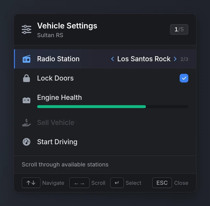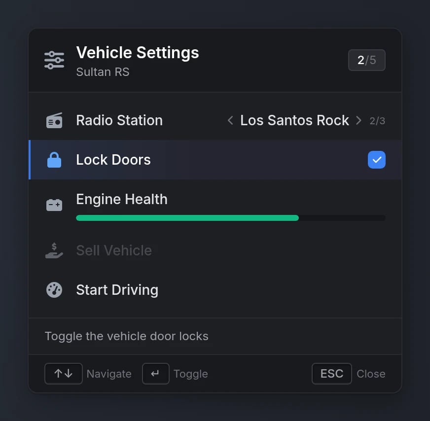
lib.registerMenu/lib.showMenu with the same callbacks, indices, and keybinds. Rows can side-scroll through values, toggle checkboxes, and display progress bars, with a built-in description panel and contextual key hints.
Looking for the mouse-driven menu with submenus and hover metadata? That’s the Menu component. The list menu is its keyboard-only sibling: flat, single-level, and driven entirely by arrow keys.
Quick Start
Functions
Keyboard Controls
While a list menu is open the cursor stays hidden and the player keeps game input (walking, driving) unless
disableInput = true. Firing, the weapon wheel, and melee are always disabled.
Configuration
Registration Options
string
required
Unique menu identifier
string
required
Menu title (supports markdown)
string
Menu subtitle (supports markdown)
string
FontAwesome icon class or image URLSupported image formats:
.png, .webp, .jpg, .jpeg, .gif, .svgstring
default:"#9CA3AF"
Icon color (hex or CSS color name)
string
Icon animation:
'spin', 'spinPulse', 'spinReverse', 'pulse', 'beat', 'fade', 'beatFade', 'bounce', 'shake'string
default:"top-left"
Menu position. Available options:
'top-left', 'top-right', 'bottom-left', 'bottom-right'boolean
default:"true"
Whether the menu can be closed with ESC/Backspace
boolean
default:"false"
true freezes game input while the menu is open (by default the player keeps moving control)function
Called when the menu is closed by the player:
onClose(keyPressed) where keyPressed is 'Escape', 'Backspace', or nil when closed via hideListMenu(true)function
Called when the highlighted option changes:
onSelected(selected, secondary, args)secondary is the 1-based scroll index on a values option, or the checked state on a checkbox optionfunction
Called when a
values option is scrolled: onSideScroll(selected, scrollIndex, args)function
Called when a checkbox option is toggled:
onCheck(selected, checked, args)table
required
Array of menu options (see Option Properties)
Option Properties
string
required
Option display text (supports markdown)
string
FontAwesome icon class or image URLSupported image formats:
.png, .webp, .jpg, .jpeg, .gif, .svgstring
default:"#9CA3AF"
Icon color (hex or CSS color name)
string
Icon animation typeAvailable options:
'spin', 'spinPulse', 'spinReverse', 'pulse', 'beat', 'fade', 'beatFade', 'bounce', 'shake'string
Shown in the description panel below the list while this option is selected (supports markdown)
number
default:"1"
1-based initial scroll index for a
values optionboolean
Makes the option a checkbox toggled in place with Enter. Set
true or false for the initial state - the presence of the field is what creates the checkboxnumber
Progress bar value (0-100) rendered under the label
string
default:"#3B82F6"
Progress bar color (hex or CSS color name)
Can also use
colorScheme as an aliasboolean
default:"false"
Rendered dimmed and skipped by keyboard navigation
boolean
default:"true"
Whether confirming this option closes the menu (
false keeps it open)table
Arguments passed to the confirm callback and events
function
Callback executed when the option is confirmed:
onSelect(selected, scrollIndex, args)string
Client event to trigger when the option is confirmed
string
Server event to trigger when the option is confirmed
Values
Each entry invalues is either a plain string or an object with its own description, which replaces the option’s description while that value is selected:
Behavior Notes
- Live updates -
setListMenuOptionsapplies to an open menu immediately, keeping the player’s selection. - State persistence - scroll positions, checkbox states and the highlighted row are remembered when a menu is closed and re-shown. A
startIndexpassed toshowListMenustill wins. Re-register the menu to reset them. - Switching menus - calling
showListMenuwhile another list menu is open switches directly without firing the first menu’sonClose.
Migrating from ox_lib
The API is deliberately signature-compatible with ox_lib’s list menu - same 1-based indices, same callbacks, same keybinds:Using our ox_lib fork?
lib.registerMenu and friends forward to the list menu automatically while lation_ui is running - existing scripts need no changes at all.Preview