Quick Start
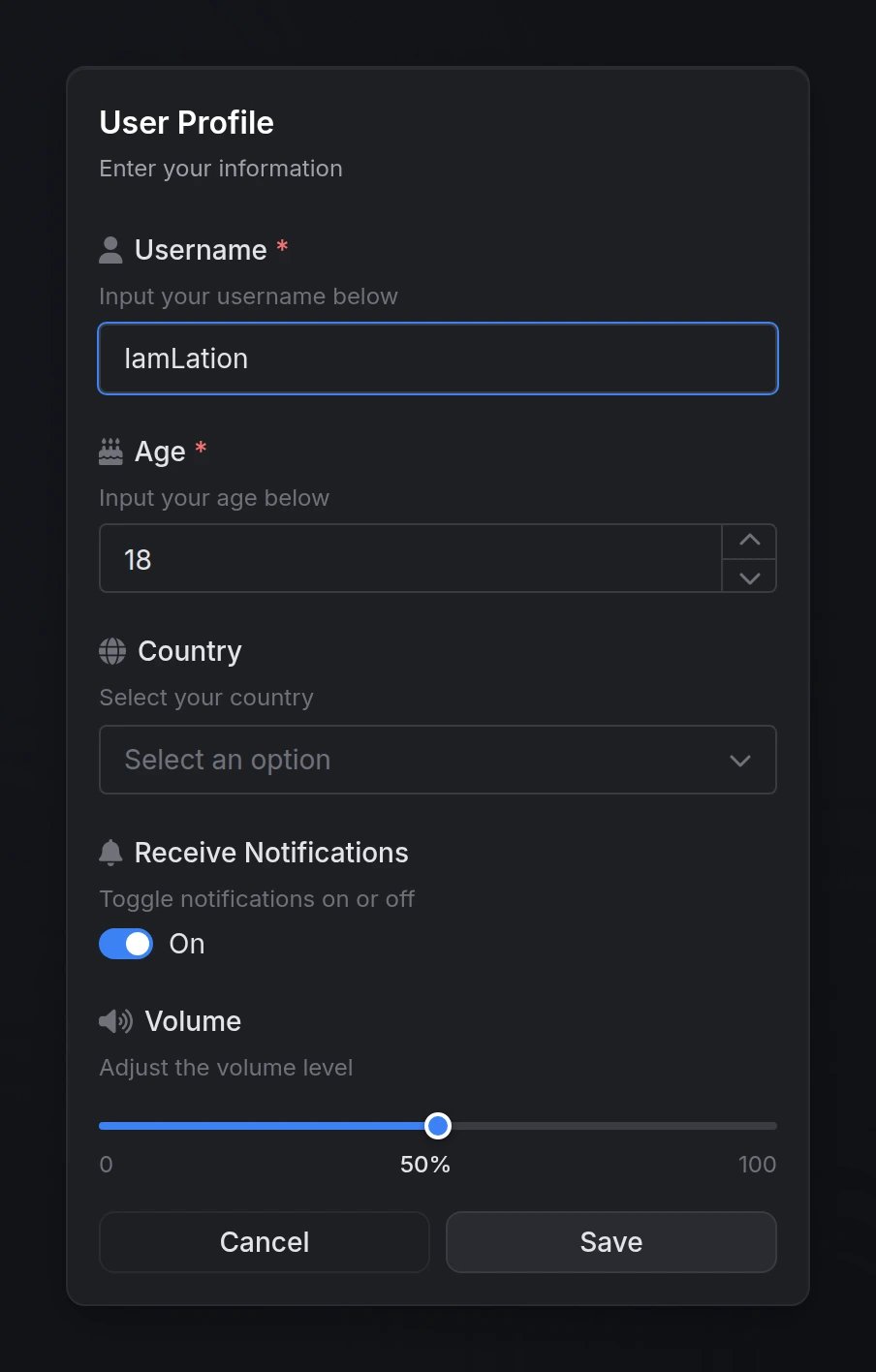
Functions
input(data) → table | nil
input(data) → table | nil
Opens an input dialog and waits for user submission.Returns:
table- Array of values indexed by field order (e.g.,result[1],result[2])nil- User cancelled or closed the dialog
closeInput()
closeInput()
Programmatically closes any currently open input dialog.
Configuration
Dialog Options
Array of field objects that define the form inputs. Each field type supports specific configuration options.See Field Types below for available types and their options.
Main dialog title displayed at the top.
Optional subtitle providing additional context or instructions.
Custom text for the submit button.
Custom text for the cancel button.
Whether to show the cancel button.
Dialog styling type to indicate context or severity.Options:
'default', 'info', 'success', 'warning', 'error'Field Types
input
Standard single-line text input field.
Must be
'input'Field label displayed above the input
Helper text displayed below the label
Placeholder text shown when empty
FontAwesome icon class (e.g.,
'fas fa-user')Icon color (hex code or CSS color name)
Default text value
Whether the field must be filled
Whether the field is disabled
Enable password field with visibility toggle
Minimum character length
Maximum character length
number
Numeric input with increment/decrement controls.
Must be
'number'Field label displayed above the input
Helper text displayed below the label
FontAwesome icon class
Icon color (hex code or CSS color name)
Default numeric value
Whether the field must be filled
Whether the field is disabled
Minimum numeric value
Maximum numeric value
Step increment (e.g.,
0.5, 5, 10)textarea
Multi-line text input for longer content.
Must be
'textarea'Field label displayed above the input
Helper text displayed below the label
Placeholder text shown when empty
FontAwesome icon class
Icon color (hex code or CSS color name)
Default text value
Whether the field must be filled
Whether the field is disabled
Minimum character length
Maximum character length
toggle / checkbox
Toggle switch or checkbox for boolean values.
'toggle' and 'checkbox' are aliases - both render the same component.Must be
'toggle' or 'checkbox'Field label displayed next to the toggle
Helper text displayed below the label
FontAwesome icon class
Icon color (hex code or CSS color name)
Default checked state (
true or false)You can also use
checked as an alias for default.Whether the field is disabled
select
Single-select dropdown menu.
Must be
'select'Field label displayed above the dropdown
Helper text displayed below the label
FontAwesome icon class
Icon color (hex code or CSS color name)
Array of option objects (see Select Options below)
Default selected value (must match an option’s
value)Whether a selection is required
Whether the field is disabled
Enable search/filter functionality
multi-select
Multi-select dropdown menu allowing multiple selections.
Must be
'multi-select'Field label displayed above the dropdown
Helper text displayed below the label
FontAwesome icon class
Icon color (hex code or CSS color name)
Array of option objects (see Select Options below)
Array of default selected values
Whether at least one selection is required
Whether the field is disabled
Enable search/filter functionality
Maximum number of selections allowed
slider
Range slider for numeric value selection.
Must be
'slider'Field label displayed above the slider
Helper text displayed below the label
FontAwesome icon class
Icon color (hex code or CSS color name)
Minimum slider value
Maximum slider value
Step increment between values
Unit label displayed next to value (e.g.,
'%', 'mph', 'px')Default slider value
Whether the field is disabled
color
Color picker with multiple format support.
Must be
'color'Field label displayed above the picker
Helper text displayed below the label
Placeholder text shown when empty
FontAwesome icon class
Icon color (hex code or CSS color name)
Color format for the returned valueOptions:
'hex'-#RRGGBB'hexa'-#RRGGBBAA'rgb'-rgb(r, g, b)'rgba'-rgba(r, g, b, a)'hsl'-hsl(h, s%, l%)'hsla'-hsla(h, s%, l%, a)
Default color value (must match specified format)
Whether a color must be selected
Whether the field is disabled
date
Date picker with customizable format and range constraints.
Must be
'date'Field label displayed above the picker
Helper text displayed below the label
Placeholder text shown when empty
FontAwesome icon class
Icon color (hex code or CSS color name)
Date format for display and return valueOptions:
'MM/dd/yyyy'- 01/15/2025'dd/MM/yyyy'- 15/01/2025'yyyy-MM-dd'- 2025-01-15'dd.MM.yyyy'- 15.01.2025
Default date value (must match specified format)
Earliest selectable date (must match specified format)
Latest selectable date (must match specified format)
Show clear button to remove selected date
Whether a date must be selected
Whether the field is disabled
date-range
Date range picker for selecting start and end dates.
Must be
'date-range'Field label displayed above the picker
Helper text displayed below the label
Placeholder text shown when empty
FontAwesome icon class
Icon color (hex code or CSS color name)
Date format for display and return valuesOptions:
'MM/dd/yyyy'- 01/15/2025'dd/MM/yyyy'- 15/01/2025'yyyy-MM-dd'- 2025-01-15'dd.MM.yyyy'- 15.01.2025
Default date range as array:
{ startDate, endDate }Earliest selectable date (must match specified format)
Latest selectable date (must match specified format)
Show clear button to remove selected range
Whether a date range must be selected
Whether the field is disabled
Select Options
For'select' and 'multi-select' field types, each option in the options array supports:
The value returned when this option is selected
Display text shown to the user (uses
value if omitted)Whether the option is disabled and cannot be selected
Preview