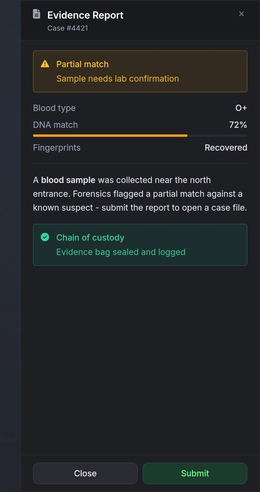
The drawer body is read-only — it does not include text inputs or form fields. Use Input for player-entered data.
Quick Start
Functions
showDrawer
showDrawer
Open a drawer panel.Parameters:
data(table) - Drawer configuration object (see Options)
opened(boolean) -trueif the drawer was shown,falseif validation failed
hideDrawer
hideDrawer
Close the currently open drawer.Parameters:
id(string, optional) - Drawer ID to close. If omitted, closes whichever drawer is open. If provided, only closes when the active drawer matches.
closed(boolean) -trueif a drawer was closed,falseotherwise
updateDrawer
updateDrawer
Partially update an open drawer without closing it.Parameters:
id(string, required) - ID of the open drawer to updatedata(table, required) - Partial drawer data to merge (e.g. newcontent,sections, oractions)
updated(boolean) -trueif the drawer was updated,falseif no matching drawer is open
isDrawerOpen
isDrawerOpen
Check if a drawer is currently open.Parameters:
id(string, optional) - If provided, checks whether that specific drawer is open
isOpen(boolean) -trueif a drawer is open (or the specified drawer is open),falseotherwise
Configuration
Options
string
required
Unique drawer identifier
string
Header title (supports markdown)
At least one of
title, subtitle, content, or sections must be provided.string
Header subtitle (supports markdown)
string
Simple markdown body text
string
FontAwesome icon class (e.g.
'fas fa-file-lines')string
default:"#9CA3AF"
Icon color using hex code or CSS color name
string
Icon animation typeAvailable options:
'spin', 'spinPulse', 'spinReverse', 'pulse', 'beat', 'fade', 'beatFade', 'bounce', 'shake'string
default:"right"
Slide-in positionOptions:
'left', 'right', 'bottom'string
default:"md"
Panel width (left/right positions only)Options:
'sm' (320px), 'md' (400px), 'lg' (480px)boolean
default:"false"
Dim the background behind the drawer
Visual only - the backdrop is not clickable. Players dismiss via X, Escape, footer actions, or
hideDrawer().boolean
default:"true"
Whether the player can dismiss the drawer interactivelyWhen
true (default):- Shows X button, footer actions, and Escape-to-close
- Enables cursor focus while keeping WASD movement
- Disables camera look while open
false:- Display-only overlay (no X, no footer buttons, no cursor lock)
- Must be closed programmatically with
hideDrawer()
table
Footer action buttonsPass one or more buttons — you are not required to include both Close and Submit.See Actions for button options.
Sections
Structured content blocks for the drawer body. Usesections instead of or alongside content.
- text
- callout
- keyValue
- image
- divider
Actions
Footer buttons for player interaction. Each button can fire a client or server event with optional data.string
required
Button text (e.g.
'Close', 'Submit', 'Confirm')string
Optional FontAwesome icon
string
default:"default"
Button styleOptions:
'default', 'primary', 'destructive'string
Client event to trigger on click
string
Server event to trigger on click
table
Data passed to
event or serverEventboolean
default:"true"
Close the drawer after the button is clickedSet to
false to fire the event and keep the drawer open (e.g. a refresh action)Footer
args are defined by your script when opening the drawer - the player does not type new data into the panel. Closing via X or Escape only notifies Lua that the drawer closed; no custom args are returned.Preview