Quick Start
Functions
Configuration
Registration Options
Unique menu identifier
Menu title (supports markdown)
Menu subtitle (supports markdown)
FontAwesome icon class or image URLSupported image formats:
.png, .webp, .jpg, .jpeg, .gif, .svgIcon color (hex or CSS color name)
Icon animation:
'spin', 'spinPulse', 'spinReverse', 'pulse', 'beat', 'fade', 'beatFade', 'bounce', 'shake'Parent menu ID (for back navigation)
Whether menu can be closed with ESC
Menu position. Available options:
'top-left', 'top-right', 'offcenter-left', 'offcenter-right'Submenus will inherit parent menu positioning
Function called when menu is closed with ESC
Array of menu options (see Option Properties)
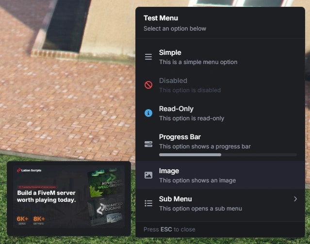
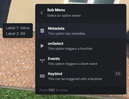
Option Properties
Option display text (supports markdown)
FontAwesome icon class or image URLSupported image formats:
.png, .webp, .jpg, .jpeg, .gif, .svgIcon color (hex or CSS color name)
Icon animation typeAvailable options:
'spin', 'spinPulse', 'spinReverse', 'pulse', 'beat', 'fade', 'beatFade', 'bounce', 'shake'Option description (supports markdown)
Keybind display text
Whether option is disabled
Whether option is read-only (no click)
Whether clicking this option closes the menu (
false keeps the menu open)Submenu ID to open
Show arrow indicator
Automatically set to true for submenus
Progress bar value (0-100)
Progress bar color (hex or CSS color name)
Can also use
colorScheme as an aliasURL to an image displayed in the hover metadata
Callback function executed when option is selected
Client event to trigger when option is selected
Server event to trigger when option is selected
Arguments passed to events
Metadata
Themetadata property displays additional information in a hover card. It supports three formats:
- Structured Array
- Key-Value Object
- String Array
Recommended approach - Provides the most control over formatting and supports progress bars.Metadata Item Properties:
The label text
The value to display
Progress bar value (0-100)
Progress bar color (hex or CSS color name)
Can also use
colorScheme as an aliasPreview