Theming
How lation ui themes stack, how admins and players use the in-game theme editor, its presets and share codes, the theme format, and the theme exports and event.
Every lation ui component is drawn from one set of theme tokens: colors, corner radius, font, UI scale, panel opacity, shadow and border width. Admins change them in game with the theme editor, players can keep their own on top if you allow it, and scripts can read or set them through exports.
How themes stack
Three layers apply in this order, each one overriding the one before it key by key:
- Built-in defaults. What you see on a fresh install.
- Server theme. Set by admins with
/uitheme, saved todata/theme.jsonand sent to every player. - Personal theme. Set by each player with
/uisettings, only while the server allows it.
A personal theme stores only what the player set, so anything they leave alone follows the server theme.
Server theme
Give your admins the ACE permission lation_ui.admin:
add_ace group.admin lation_ui.admin allowIn game, run /uitheme. The theme editor opens on the server theme, and every change shows as you make it: the editor itself wears the theme you're editing.
Press Save. lation ui writes data/theme.json and sends the new theme to every player at once.
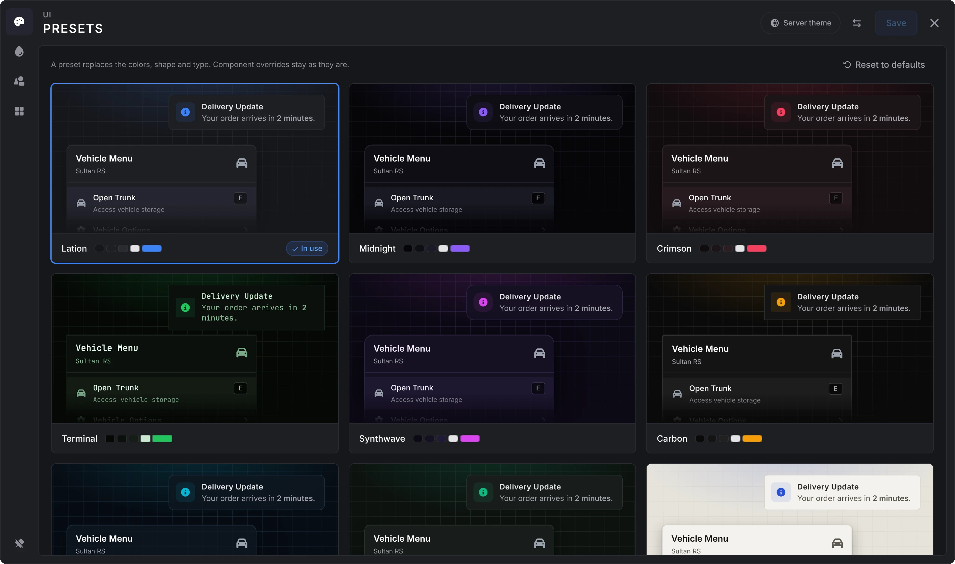
Reset to defaults, at the top of the Presets page, clears the server theme back to the built-in look for everyone. It asks first, then saves at once and closes the editor.
The server checks lation_ui.admin when the editor opens and again on every save and reset, so a player without it can't change the server theme. Each admin can save once a second, and a theme larger than 16 KB of JSON is refused (the console says Rejected theme save).
Personal themes
Turn them on. They are off by default:
setr lation_ui:allowUserThemes 1Players run /uisettings. The editor opens on their own theme, shown over the server theme.
Save keeps it on the player's own client (FiveM KVP), separately for each server, so no database is involved. Reset to server theme, on the Presets page, deletes it after asking first.
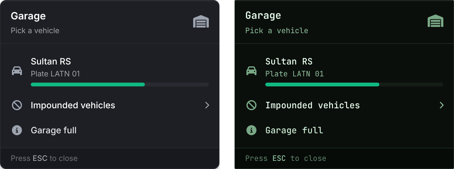
Players already connected pick up a change to the convar when they next join, or the next time an admin saves or resets the server theme. If you turn it off, saved personal themes are ignored and everyone sees the server theme; turn it back on and they return.
The theme editor
The editor is a panel with a rail of four pages down its left side: Presets, Colors, Shape & type and Components. Rest the pointer on the rail to see their names, or pin it open with the pin at its foot. Every change applies as you make it, and the editor's own panel wears the theme you're editing, so it is the preview. Nothing is kept until Save.
Along the top right:
| Control | What it does |
|---|---|
| Server theme or Personal theme | Says whose theme you're editing. Point at it for a line on who sees it. |
| The arrows | Opens Export or import, for share codes. |
| Save | Saves and closes. It stays greyed out until something has changed, and Unsaved changes shows beside it once something has. |
| The cross | Closes the editor, as Escape does. With unsaved changes it asks first; Discard puts back the theme you had before you opened it. |
A dot marks every value that differs from the preset your theme is built on (Lation, the built-in look, unless you picked another; in a personal theme, the server theme), and pointing at its row shows a button that puts that one value back. The line under each page counts them, such as "2 changed from default", with a button that resets the whole page at once.
The panel never goes below 85% opacity, so it stays readable over the game while you try a lower Panel opacity; the components take the value you set.
Presets
The editor opens on its presets: a card for each, with a notification and a menu drawn in that preset's colors and its palette beside its name. Click one and the whole editor takes that look. The one your theme is built on says In use, or Edited once you've changed anything since.
A preset replaces the colors, shape and type. Component overrides stay as they are. In a personal theme, the first card is the server theme itself, and every preset is shown over it, as it would look once saved.
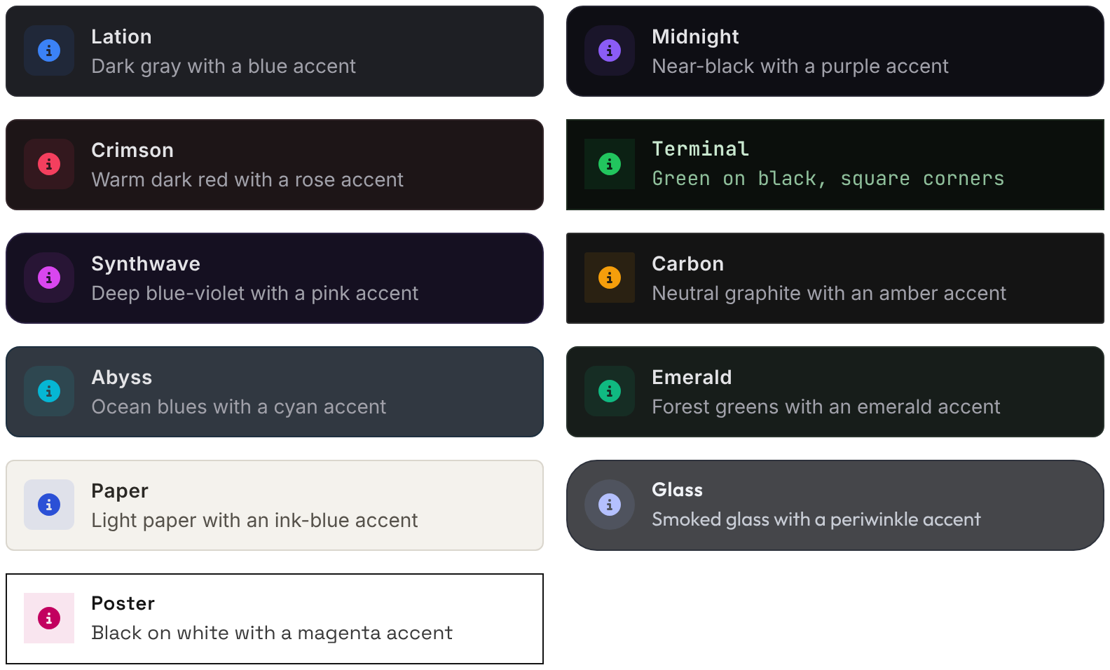
| Preset | Look |
|---|---|
| Lation | The built-in default: dark gray with a blue accent. |
| Midnight | Near-black with a purple accent, extra-rounded corners and a strong shadow. |
| Crimson | Warm dark red with a rose accent. |
| Terminal | Green on black, square corners, JetBrains Mono and no shadow. |
| Synthwave | Deep blue-violet with a pink accent, very rounded corners and a strong shadow. |
| Carbon | Neutral graphite with an amber accent, 2 px borders, small corners and no shadow. |
| Abyss | Ocean blues with a cyan accent, 85% panel opacity, rounded corners and a strong shadow. |
| Emerald | Forest greens with an emerald accent. |
| Paper | A light theme: warm paper, ink text and an ink-blue accent, 8 px corners. |
| Glass | Smoked panels at 78% opacity with no border, 24 px corners, a periwinkle accent and Outfit. |
| Poster | White panels, black type and 3 px black borders, square corners, no shadow, a magenta accent and Space Grotesk. |
Colors
Fifteen colors in four cards, each row saying what the color paints. Click a swatch for a picker, or type the hex beside it.
| Card | Colors |
|---|---|
| Accent & status | Accent, Success, Warning, Error |
| Surfaces | Surface, Header / Footer, Hover, Elevated, Well |
| Borders | Border, Border (strong) |
| Text | Text, Text (secondary), Text (muted), Headings |
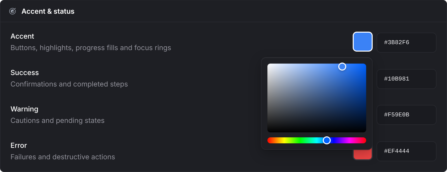
Each sets one of the color tokens.
Shape & type
| Control | Range | Default |
|---|---|---|
| Corner radius | 0 to 24 px, typed | 10 px |
| Border width | 0, 1, 2 or 3 px | 1 px |
| Font | Inter, JetBrains Mono and 18 Google Fonts, below | Inter |
| UI scale | 50% to 150%, typed | 100% |
| Panel opacity | 30% to 100%, typed | 100% |
| Shadow | None, Soft, Strong | Soft |
| Reduced motion | On or off | Off |
A number typed outside its range is brought back to the nearest end when you leave the field.
Components
A card for each of the 13 components: Notifications, Menu, List Menu, Progress Bar, Text UI, Alert Dialog, Input Dialog, Radial Menu, Drawer, Skill Check, Pattern Lock, Signal Breach and Timeline. Each says what the component is and either "Inherits the general theme" or how many values it overrides.
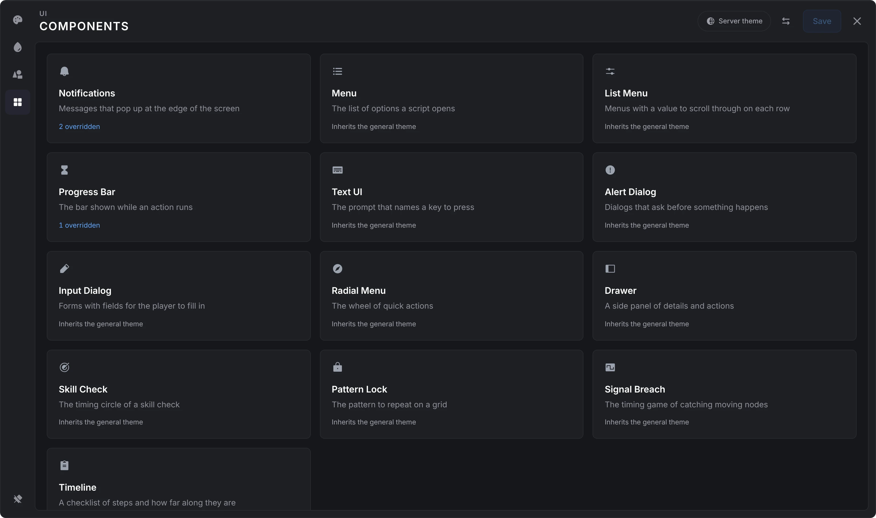
A card opens that component's own page, with an arrow back. It takes 13 of the colors (all but Text (muted) and Headings), corner radius and panel opacity. Anything left unset follows the general theme, a reset puts a value back to it, and Clear overrides at the foot of the page removes them all.
Picking a preset replaces the colors, shape and type, and keeps every component's overrides. Importing a code replaces everything, overrides included. Close without saving to get your old theme back.
Fonts
Inter (the default) and JetBrains Mono are bundled with the resource. The others load from Google Fonts the first time a theme uses them: Roboto, Rubik, Poppins, Nunito Sans, Barlow, Manrope, Sora, Outfit, Space Grotesk, IBM Plex Sans, Titillium Web, Saira, Exo 2, Chakra Petch, Oxanium, Orbitron, Fira Code and Space Mono. The Glass preset uses Outfit and Poster uses Space Grotesk, so they load them too. If a player can't reach Google Fonts, the text falls back to the next font in the stack. No other font can trigger a download. The picker lists them as Built in, Sans-serif, Display and Monospace, each name in its own face.
UI scale
lation ui scales with the screen's height, so it takes the same share of the screen at 1440p or 4K as at 1080p. It never gets smaller than its 1080p size and stops growing at twice that. UI scale multiplies on top.
Share codes
The arrows at the top of the editor open Export or import:
- Export shows the theme you're editing as one code, with Copy. If the game blocks the clipboard, select the code and copy it yourself.
- Import takes a code you paste and says at once when it isn't a theme. Apply import (or Enter) loads it into the editor in place of everything there, component overrides included. Nothing is kept until you save.
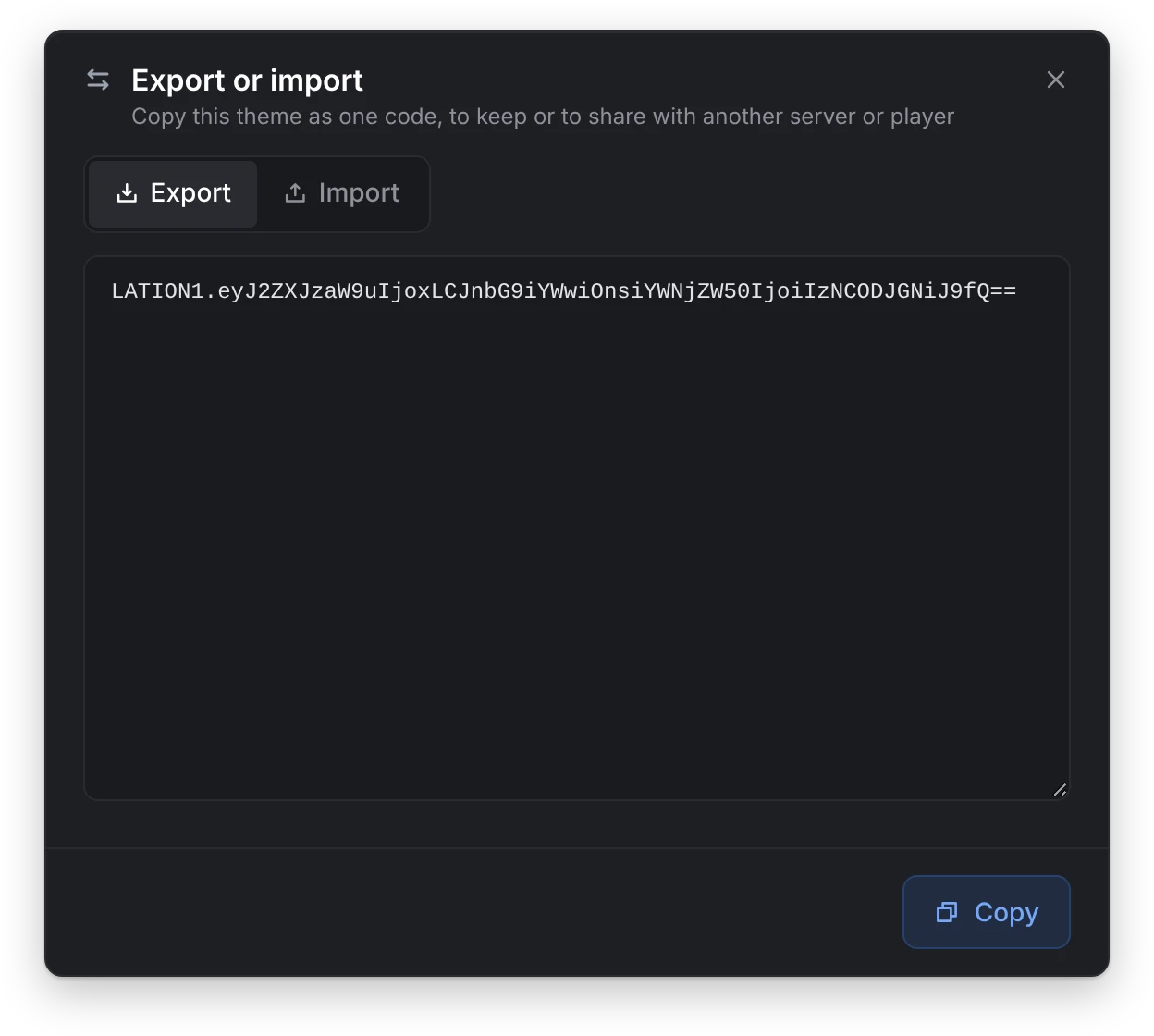
A share code is LATION1. followed by the theme as base64-encoded JSON. Paste it into Import on any server to get the same look. An imported code goes through the same checks as any other theme, so invalid values are dropped.
Theme format
A theme is one JSON object. global holds tokens for every component; components holds overrides per component. Every key is optional.
{
  "version": 1,
  "global": {
    "accent": "#8B5CF6",
    "surface": "#0E0E14",
    "radius": 14,
    "shadow": "strong"
  },
  "components": {
    "notify": { "accent": "#22C55E", "opacity": 0.9 },
    "progress": { "radius": 4 }
  }
}
The component keys are notify, menu, listmenu, progress, textui, alert, input, radial, drawer, skillcheck, patternlock, signalbreach and timeline.
lation ui checks every value when it applies a theme. Colors that aren't hex and unknown keys are dropped, and numbers are clamped to the ranges below.
Color tokens
Colors are hex strings, #RGB or #RRGGBB.
| Token | In the editor | Default | Used for |
|---|---|---|---|
accent | Accent | #3B82F6 | Highlights, focus rings, progress fill, selected rows |
accentSoft | #60A5FA | Lighter accent for text and icons | |
surface | Surface | #1E1F24 | Panel background |
surfaceBand | Header / Footer | #18191E | Header and footer bands |
surfaceHover | Hover | #252630 | Hovered rows and wedges |
surfaceElevated | Elevated | #2A2B31 | Tracks, chips and inputs |
surfaceDeep | Well | #16171B | Recessed tracks |
line | Border | #2A2B31 | Panel borders and dividers |
lineStrong | Border (strong) | #3A3B41 | Input and chip borders |
lineHover | #4A4B51 | Hovered borders | |
content | Text | #E4E4E7 | Primary text |
contentSecondary | Text (secondary) | #A1A1AA | Secondary text |
contentMuted | Text (muted) | #91919A | Muted and placeholder text |
contentIcon | #9CA3AF | Default icon color | |
contentHeading | Headings | #FFFFFF | Headings |
success | Success | #10B981 | Success states |
successSoft | #34D399 | Lighter success | |
error | Error | #EF4444 | Error states |
errorSoft | #F87171 | Lighter error | |
warning | Warning | #F59E0B | Warning states |
warningSoft | #FBBF24 | Lighter warning |
accentSoft, successSoft, errorSoft, warningSoft, lineHover and contentIcon have no control in the editor; set them in the JSON or through setServerTheme. When a theme sets accent, success, error or warning without its soft variant, the soft variant is worked out for you: the base mixed 30% toward white, or 30% toward black on a light theme.
Text on a solid accent (a selected date, a checked box) is white, or black when white would read at less than 3:1 on that accent.
Light themes
A theme whose surface is light, such as Paper or Poster, is drawn as ink on paper:
- Soft colors are worked out toward black instead of white, as above.
- Colors your scripts pass, such as an
iconColoror a progress bar'scolor, are drawn 30% darker, since they were picked for a dark panel. A notification or text UI on its ownbgColorkeeps them as passed. - Disabled list menu rows, disabled input fields and the descriptions of disabled menu options fade less.
- The alert, input and drawer buttons take their colors from the theme, and Signal Breach's cyan is deepened.
A component block that sets its own surface is judged on its own; the others follow the global one.
Other tokens
| Token | Type | Range | Default | Notes |
|---|---|---|---|---|
radius | number | 0 to 24 | 10 | Corner radius in pixels at 1080p. |
fontFamily | string | 'Inter', sans-serif | A CSS font stack of letters, digits, spaces, commas, quotes and hyphens, up to 80 characters. Only the fonts above are downloaded. | |
uiScale | number | 0.5 to 1.5 | 1 | Global only. The older name fontScale is still read. |
opacity | number | 0.3 to 1 | 1 | Panel opacity. |
shadow | string | none, soft, strong | soft | Panel shadow. |
borderWidth | number | 0 to 3 | 1 | Panel border in pixels, rounded to a whole number. |
reducedMotion | boolean | false | Global only. Shortens animations, except the progress bar fill, which carries the action's timing. |
Theme exports
Use these from your own scripts to read or set the theme.
getTheme
Client export
local theme = exports.lation_ui:getTheme()Returns
table | nil- The theme the player sees: the server theme, with their personal theme merged over it while personal themes are allowed.
nilwhen the built-in defaults are in use.
It returns the saved themes, so a theme applied with setTheme isn't part of it.
local theme = exports.lation_ui:getTheme()
local accent = theme and theme.global and theme.global.accent or '#3B82F6'
setTheme
Client export
local ok = exports.lation_ui:setTheme(theme)Parameters
themetable | nil- A theme in the format above.
nilputs back the player's saved server and personal theme.
Returns
booleantrue, orfalsewhenthemeis neither a table nornil
Applies a theme on this player's client without saving it, and fires lation_ui:themeChanged. It lasts until lation ui puts the saved theme back: when an admin saves or resets the server theme, when the player closes the theme editor, or when you call setTheme(nil).
-- A red interface while the player is wanted
exports.lation_ui:setTheme({ version = 1, global = { accent = '#EF4444' } })

-- And back to normal
exports.lation_ui:setTheme(nil)
getServerTheme
Server export
local theme = exports.lation_ui:getServerTheme()Returns
table | nil- The saved server theme, or
nilwhen none is set
local theme = exports.lation_ui:getServerTheme()
print(theme and json.encode(theme) or 'built-in theme')
setServerTheme
Server export
local ok = exports.lation_ui:setServerTheme(theme)Parameters
themetable | nil- The new server theme.
nilclears it back to the defaults.
Returns
booleantrue, orfalsewhenthemeis neither a table nornil, or its JSON is larger than 16 KB
Saves the theme to data/theme.json and sends it to every player, as Save in the editor does. It needs no permission: any server script can call it.
exports.lation_ui:setServerTheme({
    version = 1,
    global = {
        accent = '#F59E0B',
        radius = 4,
        borderWidth = 2,
        shadow = 'none'
    }
})
lation_ui:themeChanged
Client event
AddEventHandler('lation_ui:themeChanged', function(theme) end)Parameters
themetable | nil- The theme the player now sees, or
nilfor the built-in defaults
A local client event, fired whenever the theme the player sees changes: a server theme arriving, a personal theme saved or reset, or a setTheme call. The same theme twice in a row is sent once.
AddEventHandler('lation_ui:themeChanged', function(theme)
    local accent = theme and theme.global and theme.global.accent or '#3B82F6'
    SendNUIMessage({ action = 'setAccent', accent = accent })
end)
Scripts that follow the theme
lation interact, lation banking, lation shops and lation jobs read getTheme when they start and again each time lation ui's server sends the theme (the lation_ui:themeSync client event), so a server theme saved with /uitheme reaches them at once. A player's personal theme reaches them when that player next joins. They follow the global tokens; component overrides style lation ui's own components only. Without lation ui they use the same built-in defaults.
For a script of your own, listen for lation_ui:themeChanged instead: it also fires when a player saves a personal theme.
Still stuck? Ask in our Discord: the people who write the scripts answer.
Last updated
lation ui
lation ui is a UI library for FiveM that gives your scripts notifications, menus, dialogs, a progress bar, minigames and more through client exports, styled from one theme your admins edit in game.
Configuration
Every lation ui option in config.lua with its default, the convars it reads, language files, the admin permission, commands and key bindings.