Input dialog
Collect values from the player with a lation ui input dialog, with text, number, toggle, select, slider, color, date and date range fields and checks on submit.
An input dialog shows a form in the middle of the screen. The call waits until the player submits or cancels, then returns the values in field order.
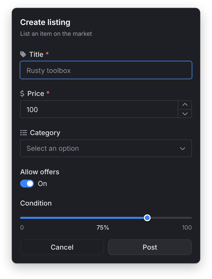
input
Client export
local values = exports.lation_ui:input(data)Parameters
data.titlestringoptionaldefault'Input Dialog'- The dialog's title
data.subtitlestringoptional- A line under the title
data.optionstable- The list of fields
data.submitTextstringoptionaldefault'Submit'- The submit button's text
data.cancelTextstringoptionaldefault'Cancel'- The cancel button's text
data.typestringoptionaldefault'default'- The submit button's style:
'default','success','warning','error','info'or'destructive' data.cancelbooleanoptionaldefaulttrue- Show the cancel button. When
false, Escape doesn't close the dialog either.
Returns
table | nil- One value per field, in the order you listed them, or
nilwhen the player cancels
The call waits for the player, so run it from a thread, command or event handler.
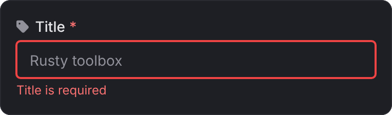
Enter submits and Escape cancels; in a textarea, Shift+Enter starts a new line. Required fields and limits are checked on submit: each field that fails turns red with a message under it, and is checked again as the player corrects it.
You can pass the list of fields itself instead of a table with options:
local values = exports.lation_ui:input({
    { type = 'input', label = 'Name' },
    { type = 'number', label = 'Amount' }
})
An empty options list shows a plain confirm, the title and buttons alone; submitting it returns an empty table. A table with no options and no fields returns nil without showing anything.
local values = exports.lation_ui:input({
    title = 'Create listing',
    subtitle = 'List an item on the market',
    submitText = 'Post',
    options = {
        {
            type = 'input',
            label = 'Title',
            placeholder = 'Rusty toolbox',
            icon = 'fas fa-tag',
            required = true,
            max = 40
        },
        {
            type = 'number',
            label = 'Price',
            icon = 'fas fa-dollar-sign',
            required = true,
            min = 1,
            default = 100
        },
        {
            type = 'select',
            label = 'Category',
            icon = 'fas fa-list',
            options = {
                { label = 'Tools', value = 'tools' },
                { label = 'Electronics', value = 'electronics' },
                { label = 'Weapons', value = 'weapons', disable = true }
            }
        },
        {
            type = 'toggle',
            label = 'Allow offers',
            default = true
        },
        {
            type = 'slider',
            label = 'Condition',
            min = 0,
            max = 100,
            unit = '%',
            default = 75
        }
    }
})

if not values then return end

local title, price, category, allowOffers, condition = values[1], values[2], values[3], values[4], values[5]
Fields
Every field takes these:
| Field | Type | Default | Description |
|---|---|---|---|
type | string | Required. One of the types below. | |
label | string | Required. The field's label. | |
description | string | Help text under the label. | |
placeholder | string | Placeholder text. | |
icon | string | An icon before the label. | |
iconColor | string | Theme muted text | The icon's color. |
required | boolean | false | The field needs a value to submit. Marked with *. Toggles and sliders always have one. |
disabled | boolean | false | Shows the field but blocks editing. |
default | any | The starting value. |
Field types
| Type | Extra options | Returns |
|---|---|---|
input | password (boolean: hides the text, with a show and hide button), min and max (characters) | string |
textarea | min and max (characters; max also shows a counter). Grows with its text. | string |
number | min, max, step (default 1). Has up and down buttons, which stop at min and max. | number, or '' when empty |
toggle | checked (the starting state, the same as a boolean default). Shows On or Off. | boolean |
checkbox | The same as toggle | boolean |
select | options, searchable (default true) | the chosen option's value, or '' |
multi-select | options, searchable (default true), max (the most picks) | a table of values |
slider | min (default 0), max (default 100), step (default 1), unit (text after the value, such as '%') | number |
color | format: 'hex' (default), 'hexa', 'rgb', 'rgba', 'hsl' or 'hsla'. The player picks or types it. | a string in that format, or '' |
date | format (default 'mm/dd/yyyy'), min and max (dates in the same format), clearable (default true) | a string in that format, or '' |
date-range | The same as date. The player picks the first and last day in one calendar. | a table of two strings in that format, earliest first, or '' |
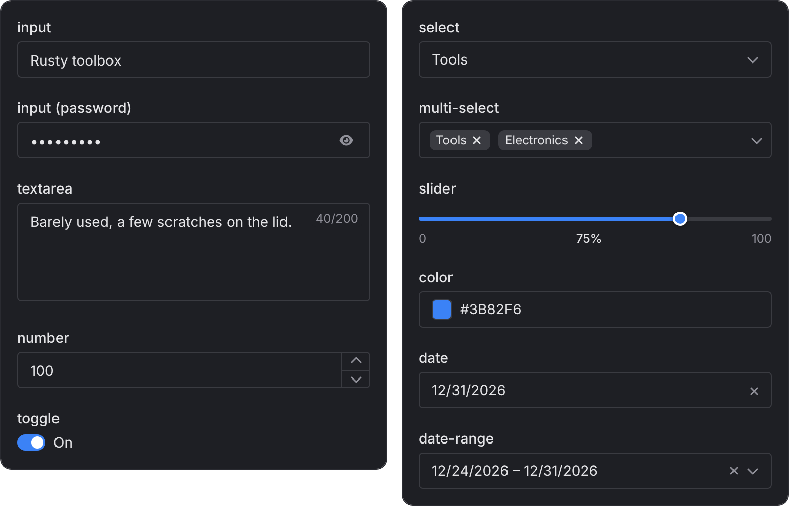
select and multi-select options are tables with a value (string or number), an optional label shown in its place, and an optional disable = true to grey one out.
A slider without a default starts at min. A multi-select default is a table of values.
A min or max you set is enforced whatever its value, 0 included: min = 0 on a number field refuses a negative number, and max = 0 on an input allows no characters. A field without them takes any number or any length, negatives included. A slider without them runs from 0 to 100.
The date format is read by its first part: a format that starts with yyyy gives 2025-12-31 style dates, dd gives 31/12/2025 and mm gives 12/31/2025. The separator in the format (/, - or .) is used in the result. A required date or date-range left empty shows "... is required" under it, like any other field.
A date-range field opens a calendar where the first click picks one end and the second the other, in either order; clicking the first day again takes the pick back. Its default is a table of two dates in its format, or both in one string split by a comma. It returns both days, so read them as two values:
local values = exports.lation_ui:input({
    title = 'Book a stay',
    options = {
        { type = 'date-range', label = 'Dates', required = true, format = 'yyyy-mm-dd' }
    }
})
if not values then return end

local checkIn, checkOut = values[1][1], values[1][2] -- '2026-12-24', '2026-12-31'
closeInput
Client export
exports.lation_ui:closeInput()Closes the open input dialog from your script. A waiting input call returns nil.
-- Give the player 30 seconds to answer
SetTimeout(30000, function() exports.lation_ui:closeInput() end)
Still stuck? Ask in our Discord: the people who write the scripts answer.
Last updated
Alert dialog
Ask the player to confirm or cancel with a lation ui alert dialog, with optional callouts, button text, sizes and styles, and close it from your script.
Context menu
Register and show lation ui context menus with submenus, icons, images, metadata, progress bars, keybinds and select callbacks.