Shared options
The icon, icon animation, color, text formatting and position values that every lation ui component accepts, and how its exports are called.
Several options work the same way in every component. They're described once here and linked from each component page.
Every export on the component pages is a client export: call it as exports.lation_ui:name(...) from a client script. The exceptions are getServerTheme and setServerTheme, and notifications, which the server can send through an event.
The exports that wait for the player (alert, input, progressBar and the minigames) return only when the player is done, so call them from a thread, a command or an event handler, never from a loop that must keep running.
Icons
lation ui bundles the free Font Awesome 6 solid, regular and brands icons. Pass an icon as a class string:
icon = 'fas fa-wrench'   -- solid
icon = 'far fa-bell'     -- regular
icon = 'fab fa-discord'  -- brands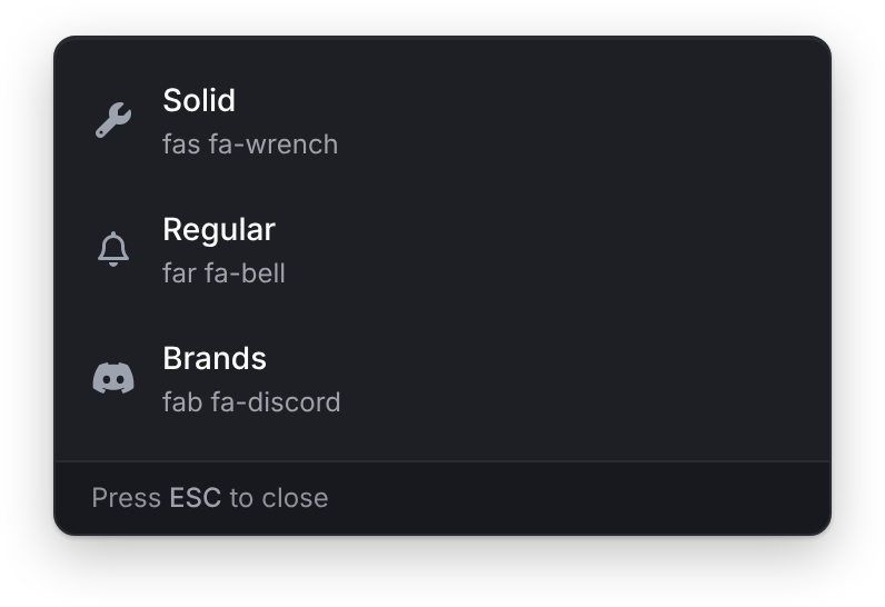
The class string works everywhere. Most components also take a bare solid icon name such as 'wrench', but the alert dialog's icon needs the class string.
Context menus, list menus and the radial menu also take an image URL as an icon. Any value that contains ://, .png, .webp, .jpg, .jpeg, .gif or .svg is drawn as an image.
Icon animations
Fields named iconAnimation (and headerIconAnimation on context menus) take one of these Font Awesome animations:
| Value | Does |
|---|---|
spin | Turns clockwise |
spinPulse | Turns in eight steps |
spinReverse | Turns counter-clockwise |
pulse | Turns in steps, like spinPulse |
beat | Grows and shrinks |
fade | Fades in and out |
beatFade | Grows and fades together |
bounce | Bounces |
shake | Shakes |
Colors
Per-call colors such as iconColor, progressColor or badgeColor take any CSS color string, for example '#EF4444' or 'rgb(239, 68, 68)'. Two exceptions:
- Notification
bgColor,txtColorandtitleColortake six-digit hex (#RRGGBB) only. Anything else is ignored and the theme colors are used. - Text UI
bgColoris drawn exactly as passed, so it ignores the theme's panel opacity.
When you don't pass a color, the component uses the theme. On a light theme such as Paper or Poster, the colors you pass are drawn 30% darker so they still read on a light panel; on a dark theme they're drawn exactly as passed. A notification or text UI with its own bgColor always keeps them as passed.
Text formatting
Most text fields take a small set of Markdown:
| Syntax | Result |
|---|---|
**bold** | Bold |
*italic* | Italic |
`code` | Inline code |
# Heading, ## Heading, ### Heading | A heading, when the line starts with it |
 | An image, up to 200 px tall |
\n | A line break |
These fields take it:
| Component | Fields |
|---|---|
| Notifications | title, message |
| Alert dialog | header, content, callout label and description |
| Context menu | title, subtitle, option title and description |
| List menu | title, subtitle, option label and description |
| Text UI | title, description, option label |
| Timeline | title, description, task label and description |
| Drawer | title, subtitle, content, text sections, callouts, image captions |
Progress bars, input dialogs, the radial menu and the minigames show text as written.
Positions
| Component | Values | Default | Convar override |
|---|---|---|---|
| Notifications | top-left, top, top-right, center-left, center-right, bottom-left, bottom, bottom-right | top-right | lation:position:notify |
| Context menu | top-left, top-right, offcenter-left, offcenter-right | top-right | lation:position:menu |
| List menu | top-left, top-right, bottom-left, bottom-right | top-left | lation:position:listmenu |
| Text UI | top-left, top-center, top-right, left-center, center, right-center, bottom-left, bottom-center, bottom-right | right-center | lation:position:textui |
| Timeline | The same nine as text UI | right-center | None |
| Drawer | left, right, bottom | right | None |
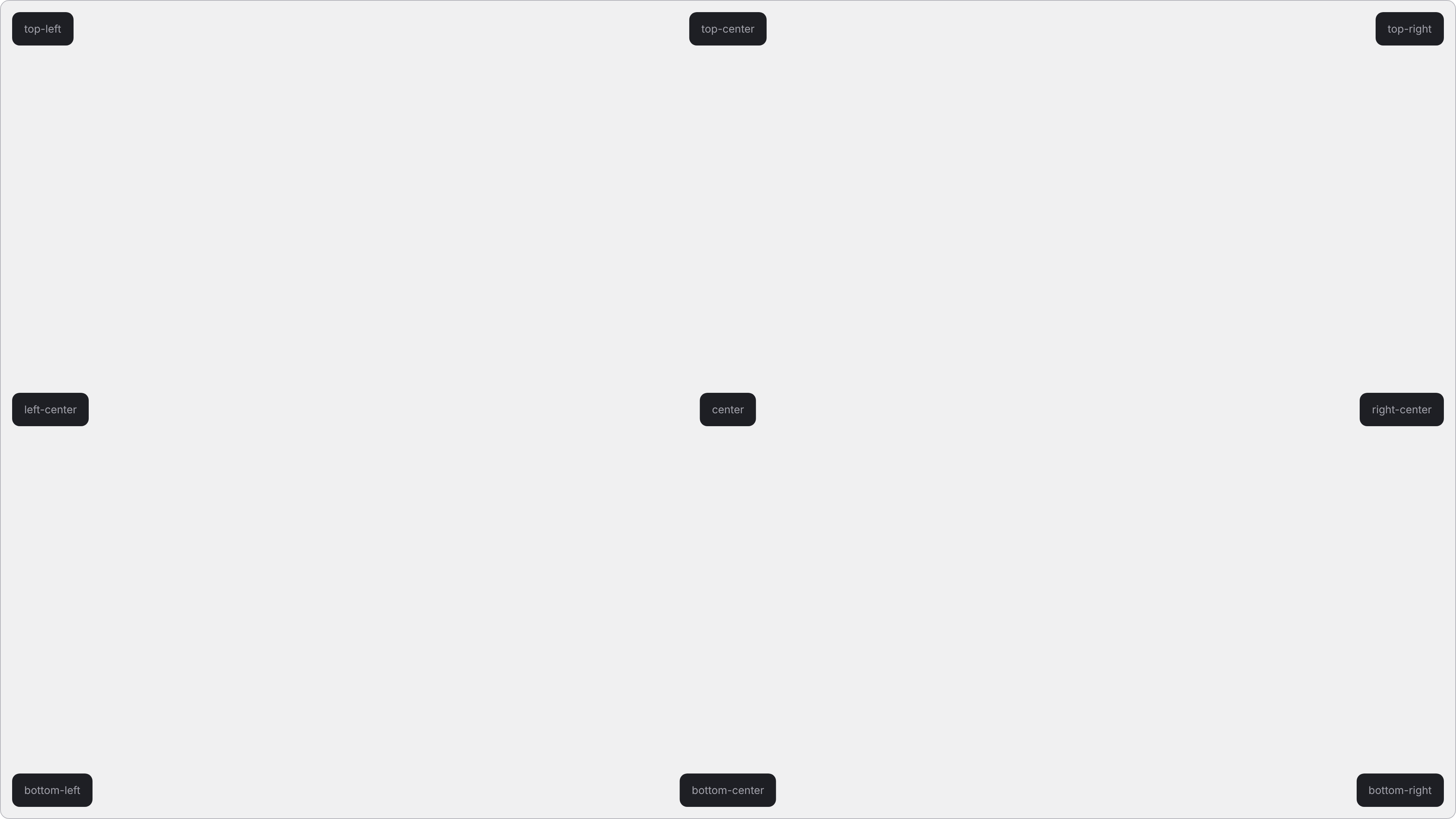
The progress bar always sits at the bottom center of the screen, and alert and input dialogs in the middle.
A convar override replaces the position for every call to that component, whatever the script passes. Set it with setr; see convars.
Notifications also take top-center and bottom-center as older names for top and bottom. An unknown notification position, passed or set in the convar, falls back to top-right.
Still stuck? Ask in our Discord: the people who write the scripts answer.
Last updated