> ## Documentation Index
> Fetch the complete documentation index at: https://lationscripts.com/docs/llms.txt
> Use this file to discover all available pages before exploring further.

# Modern UI - Input

> Input dialogs provide forms with various field types for collecting user data.

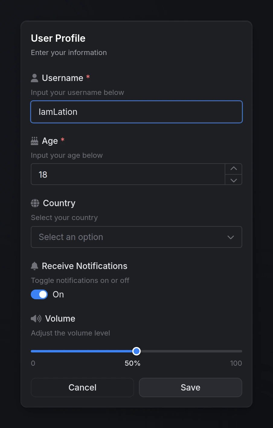
Input dialogs provide flexible forms for collecting user data with support for validation, default values, and a wide variety of field types.

## Quick Start

```lua theme={null}
local result = exports.lation_ui:input({
    title = 'User Registration',
    options = {
        {
            type = 'input',
            label = 'Username',
            placeholder = 'Enter username',
            required = true
        },
        {
            type = 'number',
            label = 'Age',
            min = 18,
            max = 100,
            required = true
        }
    }
})

if result then
    print('Username:', result[1])
    print('Age:', result[2])
end
```

## Functions

<AccordionGroup>
  <Accordion title="input(data) → table | nil" icon="code">
    Opens an input dialog and waits for user submission.

    **Returns:**

    * `table` - Array of values indexed by field order (e.g., `result[1]`, `result[2]`)
    * `nil` - User cancelled or closed the dialog

    ```lua theme={null}
    local result = exports.lation_ui:input({
        title = 'Enter Details',
        options = { ... }
    })

    if result then
        -- Process input values
        print('First field:', result[1])
    end
    ```
  </Accordion>

  <Accordion title="closeInput()" icon="xmark">
    Programmatically closes any currently open input dialog.

    ```lua theme={null}
    exports.lation_ui:closeInput()
    ```
  </Accordion>
</AccordionGroup>

## Configuration

### Dialog Options

<ParamField body="options" type="table" required>
  Array of field objects that define the form inputs. Each field type supports specific configuration options.

  See [Field Types](#field-types) below for available types and their options.
</ParamField>

<ParamField body="title" type="string">
  Main dialog title displayed at the top.
</ParamField>

<ParamField body="subtitle" type="string">
  Optional subtitle providing additional context or instructions.
</ParamField>

<ParamField body="submitText" default="Submit" type="string">
  Custom text for the submit button.
</ParamField>

<ParamField body="cancelText" default="Cancel" type="string">
  Custom text for the cancel button.
</ParamField>

<ParamField body="cancel" default="true" type="boolean">
  Whether to show the cancel button.
</ParamField>

<ParamField body="type" default="default" type="string">
  Dialog styling type to indicate context or severity.

  **Options:** `'default'`, `'info'`, `'success'`, `'warning'`, `'error'`
</ParamField>

## Field Types

### `input`

Standard single-line text input field.

<ParamField body="type" type="string" required>
  Must be `'input'`
</ParamField>

<ParamField body="label" type="string" required>
  Field label displayed above the input
</ParamField>

<ParamField body="description" type="string">
  Helper text displayed below the label
</ParamField>

<ParamField body="placeholder" type="string">
  Placeholder text shown when empty
</ParamField>

<ParamField body="icon" type="string">
  FontAwesome icon class (e.g., `'fas fa-user'`)
</ParamField>

<ParamField body="iconColor" default="#71717A" type="string">
  Icon color (hex code or CSS color name)
</ParamField>

<ParamField body="default" type="string">
  Default text value
</ParamField>

<ParamField body="required" default="false" type="boolean">
  Whether the field must be filled
</ParamField>

<ParamField body="disabled" default="false" type="boolean">
  Whether the field is disabled
</ParamField>

<ParamField body="password" default="false" type="boolean">
  Enable password field with visibility toggle
</ParamField>

<ParamField body="min" type="number">
  Minimum character length
</ParamField>

<ParamField body="max" type="number">
  Maximum character length
</ParamField>

### `number`

Numeric input with increment/decrement controls.

<ParamField body="type" type="string" required>
  Must be `'number'`
</ParamField>

<ParamField body="label" type="string" required>
  Field label displayed above the input
</ParamField>

<ParamField body="description" type="string">
  Helper text displayed below the label
</ParamField>

<ParamField body="icon" type="string">
  FontAwesome icon class
</ParamField>

<ParamField body="iconColor" default="#71717A" type="string">
  Icon color (hex code or CSS color name)
</ParamField>

<ParamField body="default" type="number">
  Default numeric value
</ParamField>

<ParamField body="required" default="false" type="boolean">
  Whether the field must be filled
</ParamField>

<ParamField body="disabled" default="false" type="boolean">
  Whether the field is disabled
</ParamField>

<ParamField body="min" type="number">
  Minimum numeric value
</ParamField>

<ParamField body="max" type="number">
  Maximum numeric value
</ParamField>

<ParamField body="step" default={1} type="number">
  Step increment (e.g., `0.5`, `5`, `10`)
</ParamField>

### `textarea`

Multi-line text input for longer content.

<ParamField body="type" type="string" required>
  Must be `'textarea'`
</ParamField>

<ParamField body="label" type="string" required>
  Field label displayed above the input
</ParamField>

<ParamField body="description" type="string">
  Helper text displayed below the label
</ParamField>

<ParamField body="placeholder" type="string">
  Placeholder text shown when empty
</ParamField>

<ParamField body="icon" type="string">
  FontAwesome icon class
</ParamField>

<ParamField body="iconColor" default="#71717A" type="string">
  Icon color (hex code or CSS color name)
</ParamField>

<ParamField body="default" type="string">
  Default text value
</ParamField>

<ParamField body="required" default="false" type="boolean">
  Whether the field must be filled
</ParamField>

<ParamField body="disabled" default="false" type="boolean">
  Whether the field is disabled
</ParamField>

<ParamField body="min" type="number">
  Minimum character length
</ParamField>

<ParamField body="max" type="number">
  Maximum character length
</ParamField>

### `toggle` / `checkbox`

Toggle switch or checkbox for boolean values.

<Note>
  `'toggle'` and `'checkbox'` are aliases - both render the same component.
</Note>

<ParamField body="type" type="string" required>
  Must be `'toggle'` or `'checkbox'`
</ParamField>

<ParamField body="label" type="string" required>
  Field label displayed next to the toggle
</ParamField>

<ParamField body="description" type="string">
  Helper text displayed below the label
</ParamField>

<ParamField body="icon" type="string">
  FontAwesome icon class
</ParamField>

<ParamField body="iconColor" default="#71717A" type="string">
  Icon color (hex code or CSS color name)
</ParamField>

<ParamField body="default" type="boolean">
  Default checked state (`true` or `false`)

  <Note>
    You can also use `checked` as an alias for `default`.
  </Note>
</ParamField>

<ParamField body="disabled" default="false" type="boolean">
  Whether the field is disabled
</ParamField>

### `select`

Single-select dropdown menu.

<ParamField body="type" type="string" required>
  Must be `'select'`
</ParamField>

<ParamField body="label" type="string" required>
  Field label displayed above the dropdown
</ParamField>

<ParamField body="description" type="string">
  Helper text displayed below the label
</ParamField>

<ParamField body="icon" type="string">
  FontAwesome icon class
</ParamField>

<ParamField body="iconColor" default="#71717A" type="string">
  Icon color (hex code or CSS color name)
</ParamField>

<ParamField body="options" type="table" required>
  Array of option objects (see [Select Options](#select-options) below)
</ParamField>

<ParamField body="default" type="any">
  Default selected value (must match an option's `value`)
</ParamField>

<ParamField body="required" default="false" type="boolean">
  Whether a selection is required
</ParamField>

<ParamField body="disabled" default="false" type="boolean">
  Whether the field is disabled
</ParamField>

<ParamField body="searchable" default="true" type="boolean">
  Enable search/filter functionality
</ParamField>

### `multi-select`

Multi-select dropdown menu allowing multiple selections.

<ParamField body="type" type="string" required>
  Must be `'multi-select'`
</ParamField>

<ParamField body="label" type="string" required>
  Field label displayed above the dropdown
</ParamField>

<ParamField body="description" type="string">
  Helper text displayed below the label
</ParamField>

<ParamField body="icon" type="string">
  FontAwesome icon class
</ParamField>

<ParamField body="iconColor" default="#71717A" type="string">
  Icon color (hex code or CSS color name)
</ParamField>

<ParamField body="options" type="table" required>
  Array of option objects (see [Select Options](#select-options) below)
</ParamField>

<ParamField body="default" type="table">
  Array of default selected values

  ```lua theme={null}
  default = {'option1', 'option2'}
  ```
</ParamField>

<ParamField body="required" default="false" type="boolean">
  Whether at least one selection is required
</ParamField>

<ParamField body="disabled" default="false" type="boolean">
  Whether the field is disabled
</ParamField>

<ParamField body="searchable" default="true" type="boolean">
  Enable search/filter functionality
</ParamField>

<ParamField body="max" type="number">
  Maximum number of selections allowed
</ParamField>

### `slider`

Range slider for numeric value selection.

<ParamField body="type" type="string" required>
  Must be `'slider'`
</ParamField>

<ParamField body="label" type="string" required>
  Field label displayed above the slider
</ParamField>

<ParamField body="description" type="string">
  Helper text displayed below the label
</ParamField>

<ParamField body="icon" type="string">
  FontAwesome icon class
</ParamField>

<ParamField body="iconColor" default="#71717A" type="string">
  Icon color (hex code or CSS color name)
</ParamField>

<ParamField body="min" type="number" required>
  Minimum slider value
</ParamField>

<ParamField body="max" type="number" required>
  Maximum slider value
</ParamField>

<ParamField body="step" default={1} type="number">
  Step increment between values
</ParamField>

<ParamField body="unit" type="string">
  Unit label displayed next to value (e.g., `'%'`, `'mph'`, `'px'`)
</ParamField>

<ParamField body="default" type="number">
  Default slider value
</ParamField>

<ParamField body="disabled" default="false" type="boolean">
  Whether the field is disabled
</ParamField>

### `color`

Color picker with multiple format support.

<ParamField body="type" type="string" required>
  Must be `'color'`
</ParamField>

<ParamField body="label" type="string" required>
  Field label displayed above the picker
</ParamField>

<ParamField body="description" type="string">
  Helper text displayed below the label
</ParamField>

<ParamField body="placeholder" type="string">
  Placeholder text shown when empty
</ParamField>

<ParamField body="icon" type="string">
  FontAwesome icon class
</ParamField>

<ParamField body="iconColor" default="#71717A" type="string">
  Icon color (hex code or CSS color name)
</ParamField>

<ParamField body="format" default="hex" type="string">
  Color format for the returned value

  **Options:**

  * `'hex'` - `#RRGGBB`
  * `'hexa'` - `#RRGGBBAA`
  * `'rgb'` - `rgb(r, g, b)`
  * `'rgba'` - `rgba(r, g, b, a)`
  * `'hsl'` - `hsl(h, s%, l%)`
  * `'hsla'` - `hsla(h, s%, l%, a)`
</ParamField>

<ParamField body="default" type="string">
  Default color value (must match specified format)
</ParamField>

<ParamField body="required" default="false" type="boolean">
  Whether a color must be selected
</ParamField>

<ParamField body="disabled" default="false" type="boolean">
  Whether the field is disabled
</ParamField>

### `date`

Date picker with customizable format and range constraints.

<ParamField body="type" type="string" required>
  Must be `'date'`
</ParamField>

<ParamField body="label" type="string" required>
  Field label displayed above the picker
</ParamField>

<ParamField body="description" type="string">
  Helper text displayed below the label
</ParamField>

<ParamField body="placeholder" type="string">
  Placeholder text shown when empty
</ParamField>

<ParamField body="icon" type="string">
  FontAwesome icon class
</ParamField>

<ParamField body="iconColor" default="#71717A" type="string">
  Icon color (hex code or CSS color name)
</ParamField>

<ParamField body="format" default="MM/dd/yyyy" type="string">
  Date format for display and return value

  **Options:**

  * `'MM/dd/yyyy'` - 01/15/2025
  * `'dd/MM/yyyy'` - 15/01/2025
  * `'yyyy-MM-dd'` - 2025-01-15
  * `'dd.MM.yyyy'` - 15.01.2025
</ParamField>

<ParamField body="default" type="string">
  Default date value (must match specified format)
</ParamField>

<ParamField body="min" type="string">
  Earliest selectable date (must match specified format)
</ParamField>

<ParamField body="max" type="string">
  Latest selectable date (must match specified format)
</ParamField>

<ParamField body="clearable" default="true" type="boolean">
  Show clear button to remove selected date
</ParamField>

<ParamField body="required" default="false" type="boolean">
  Whether a date must be selected
</ParamField>

<ParamField body="disabled" default="false" type="boolean">
  Whether the field is disabled
</ParamField>

### `date-range`

Date range picker for selecting start and end dates.

<ParamField body="type" type="string" required>
  Must be `'date-range'`
</ParamField>

<ParamField body="label" type="string" required>
  Field label displayed above the picker
</ParamField>

<ParamField body="description" type="string">
  Helper text displayed below the label
</ParamField>

<ParamField body="placeholder" type="string">
  Placeholder text shown when empty
</ParamField>

<ParamField body="icon" type="string">
  FontAwesome icon class
</ParamField>

<ParamField body="iconColor" default="#71717A" type="string">
  Icon color (hex code or CSS color name)
</ParamField>

<ParamField body="format" default="MM/dd/yyyy" type="string">
  Date format for display and return values

  **Options:**

  * `'MM/dd/yyyy'` - 01/15/2025
  * `'dd/MM/yyyy'` - 15/01/2025
  * `'yyyy-MM-dd'` - 2025-01-15
  * `'dd.MM.yyyy'` - 15.01.2025
</ParamField>

<ParamField body="default" type="table">
  Default date range as array: `{ startDate, endDate }`

  ```lua theme={null}
  default = { '01/01/2025', '01/07/2025' }
  ```
</ParamField>

<ParamField body="min" type="string">
  Earliest selectable date (must match specified format)
</ParamField>

<ParamField body="max" type="string">
  Latest selectable date (must match specified format)
</ParamField>

<ParamField body="clearable" default="true" type="boolean">
  Show clear button to remove selected range
</ParamField>

<ParamField body="required" default="false" type="boolean">
  Whether a date range must be selected
</ParamField>

<ParamField body="disabled" default="false" type="boolean">
  Whether the field is disabled
</ParamField>

### Select Options

For `'select'` and `'multi-select'` field types, each option in the `options` array supports:

<ParamField body="value" type="any" required>
  The value returned when this option is selected

  ```lua theme={null}
  value = 'us'
  value = 123
  value = true
  ```
</ParamField>

<ParamField body="label" type="string">
  Display text shown to the user (uses `value` if omitted)

  ```lua theme={null}
  { label = 'United States', value = 'us' }
  ```
</ParamField>

<ParamField body="disable" default="false" type="boolean">
  Whether the option is disabled and cannot be selected

  ```lua theme={null}
  { label = 'Coming Soon', value = 'beta', disable = true }
  ```
</ParamField>

## Preview

<Frame>
  <img src="https://mintcdn.com/lationscripts/Ti0acW9JT3q4BC3Y/resources/modern-ui/components/input-dialog/user-data-example.webp?fit=max&auto=format&n=Ti0acW9JT3q4BC3Y&q=85&s=3a4fc5a5055a48fa292ca0f5ca82752b" alt="Input dialog example" width="904" height="1416" data-path="resources/modern-ui/components/input-dialog/user-data-example.webp" />
</Frame>