> ## Documentation Index
> Fetch the complete documentation index at: https://lationscripts.com/docs/llms.txt
> Use this file to discover all available pages before exploring further.
# Modern UI - Alert
> Alert dialogs used for confirmations, warnings, info messages and more.
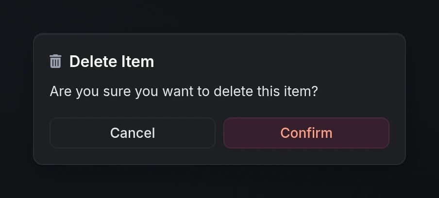
Alert dialogs provide a flexible way to show confirmations, warnings, informational messages, and more with support for markdown content, custom icons, and styled callouts.
## Quick Start
```lua theme={null}
local result = exports.lation_ui:alert({
header = 'Delete Item',
content = 'Are you sure you want to delete this item?',
icon = 'fas fa-trash',
iconColor = '#EF4444',
type = 'error'
})
if result == 'confirm' then
print('Item deleted!')
end
```
## Functions
Opens an alert dialog and waits for user interaction.
**Returns:**
* `'confirm'` - User clicked the confirm button
* `'cancel'` - User clicked cancel or closed the dialog
```lua theme={null}
local result = exports.lation_ui:alert({
header = 'Confirm Action',
content = 'Do you want to continue?'
})
```
Programmatically closes any currently open alert dialog.
```lua theme={null}
exports.lation_ui:closeAlert()
```
## Configuration
### Dialog Options
The dialog header text. Supports markdown formatting.
Either `header` or `content` must be provided.
The main content text displayed in the dialog. Supports markdown formatting.
Either `header` or `content` must be provided.
FontAwesome icon class (e.g., `'fas fa-trash'`, `'fas fa-info-circle'`).
Icon color using hex code or [CSS color name](https://htmlcolorcodes.com/color-names/).
```lua theme={null}
iconColor = '#EF4444' -- Hex code
iconColor = 'red' -- CSS color name
```
Dialog type that affects the overall styling.
**Options:** `'default'`, `'info'`, `'success'`, `'warning'`, `'error'`
Dialog size for responsive layouts.
**Options:** `'xs'`, `'sm'`, `'md'`, `'lg'`, `'xl'`
Whether to show the cancel button.
Custom button labels for custom text.
```lua theme={null}
labels = {
cancel = 'No',
confirm = 'Yes'
}
```
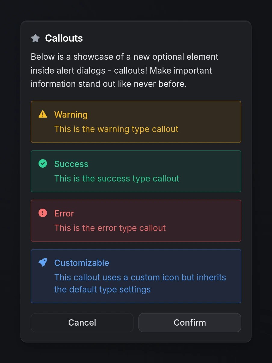
Array of callout objects to highlight important information within the dialog.
See [Callouts](#callouts) section below for detailed options.
### Callouts
Callouts are styled information boxes that can be added to alert dialogs to emphasize critical information.
The callout content text. Supports markdown formatting.
The callout title/header. Supports markdown formatting.
Callout styling type.
**Options:** `'info'`, `'success'`, `'warning'`, `'error'`
Custom FontAwesome icon. Inherits the color from the callout type.
```lua theme={null}
icon = 'fas fa-rocket'
```
## Preview